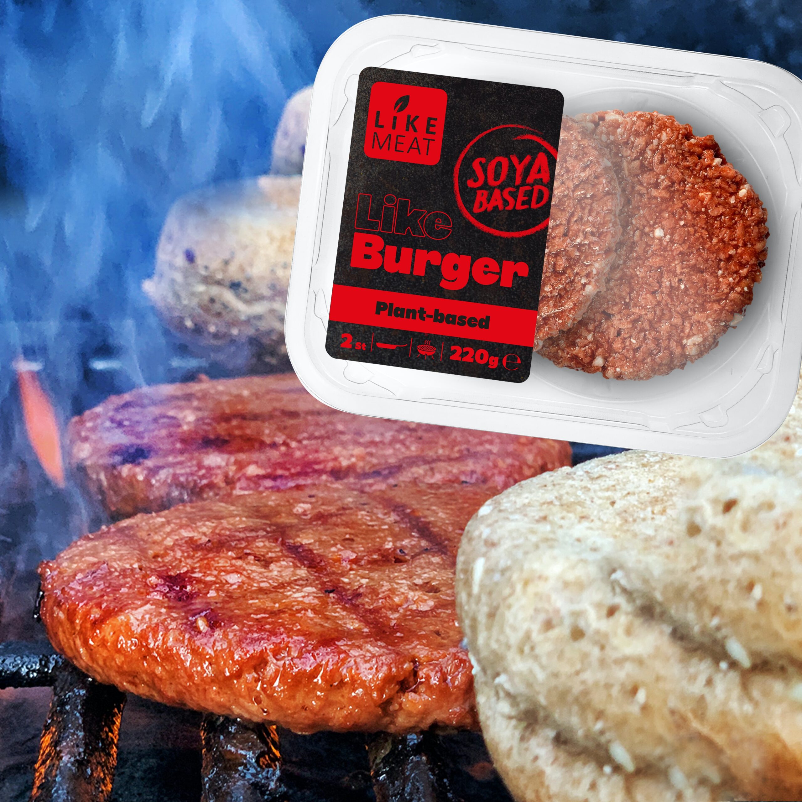
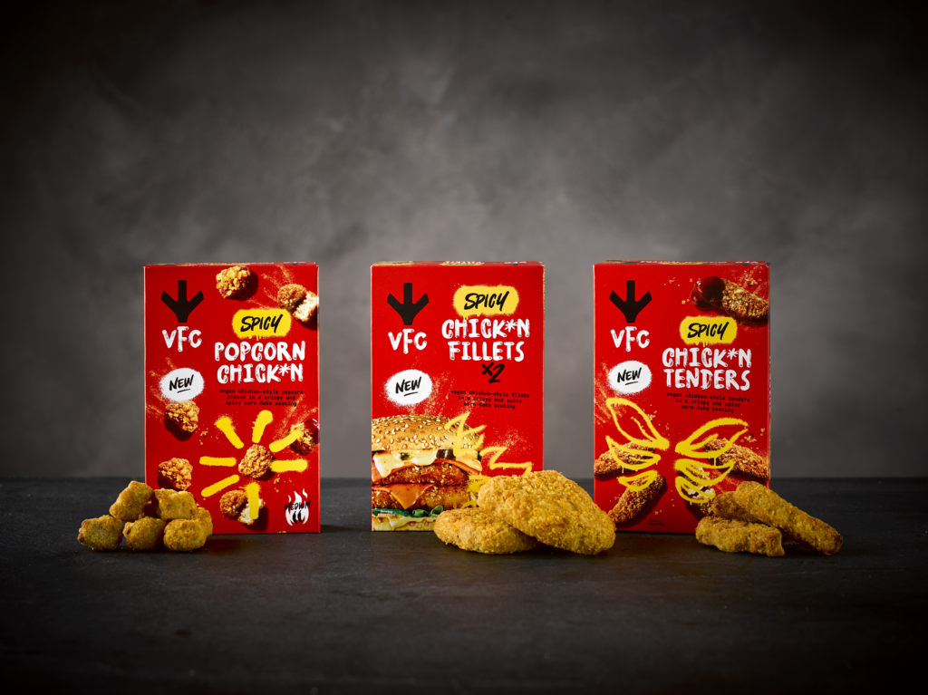
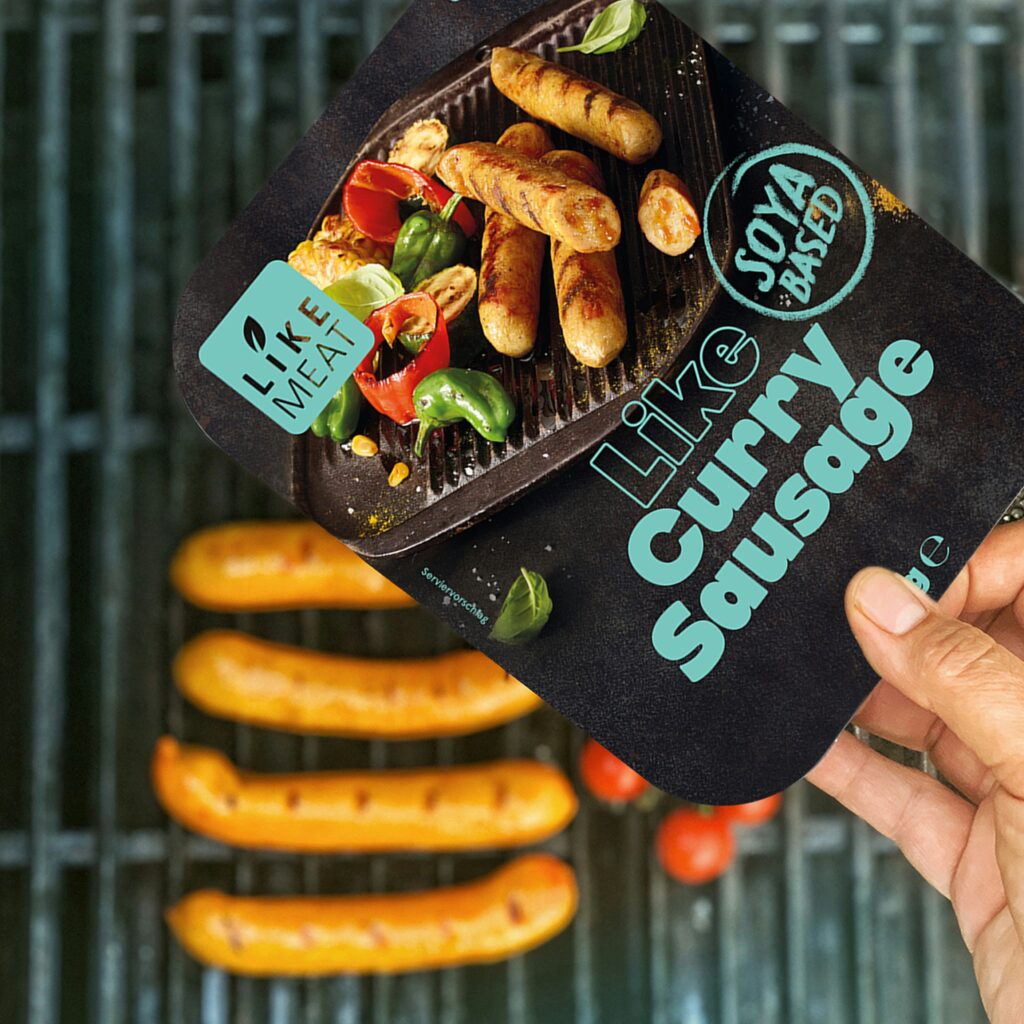
Is the color of your product packaging putting off consumers?
Plant-based meats offer numerous advantages over animal-based products – health and sustainability benefits, to name a few. Yet, not all consumers will buy a plant-based sausage, for example, over an animal-based one. Why? Barriers to consumption persist.
Common factors and hurdles that influence food choices include taste, price, and health. However, the visual appeal of packaging is also important; it can even play a part in altering consumer perception of these barriers.
Think about it – a product’s packaging is its visual handshake with consumers; it’s the first interaction, where preconceptions are challenged and perceptions formed.
In addition to the obvious impact of price, consumers’ purchase decisions are guided by a range of factors that are designed to influence their choice. These include product design, labeling, product placement, promotions, and other persuasive marketing material.
Remarkably, simply using appealing colors in product packaging has the power to reshape consumer behavior and prompt a shift toward plant-based meat. Because we eat with our eyes as well as our mouths, the branding of food products should strive to be as visually appealing as possible for customers. Color, especially, can evoke emotions and convey certain messages.1
When used in packaging, color can attract attention, create positive associations, and enhance brand recognition.2 Thus, it is crucial to understand how color influences consumers’ purchase decisions in the context of plant-based meat products, particularly given the lack of research on specific colors used in plant-based branding.
Our latest report delved into this topic using exclusive consumer research and surveys. It took a selection of packaging colors to determine which are most appealing to customers in the context of plant-based meat products.
Nudging consumers towards plant-based meat consumption
The Power of Color looked at 1,200 respondents from the US and UK. The two countries were chosen to ensure a diverse perspective, encompassing distinct cultural contexts and geographical regions. To investigate the impact of colors on consumer behavior, participants were randomly divided into six groups. Each group was shown a different color of plant-based meat packaging (green, blue, orange, purple, red, or yellow).
This article will summarize the main learnings from our report and enable you to implement the most significant insights into your business strategy.
Let’s jump in.
6 key takeaways
1. The color of the packaging matters
Our research revealed that color significantly influences consumer behavior and willingness to purchase plant-based meat products. A substantial 65% of survey respondents said that colors have an impact on their purchase decision, illustrating the untapped potential of the use of color in packaging.
→ Actionable insight: Harness the power of color differentiation to outshine your competitors and evoke the desired consumer responses (more on these, later).
2. Green suggests health, freshness, and eco-friendliness
In the world of plant-based meat, green symbolizes health, freshness, and eco-friendliness. An impressive 75% of UK respondents linked green packaging with healthiness, 78% with eco-friendliness, and 75% with safety. In the US, a lower percentage of respondents associated green with healthiness – 58% – while 69% linked it with naturalness, and 68% with eco-friendliness.
→ Actionable insight: Embrace green – in moderation – in your packaging, only if you want to communicate sustainability and health benefits. Incorporate visuals of fresh produce, natural elements, and trusted sustainability certifications to increase resonance with environmentally-conscious consumers.
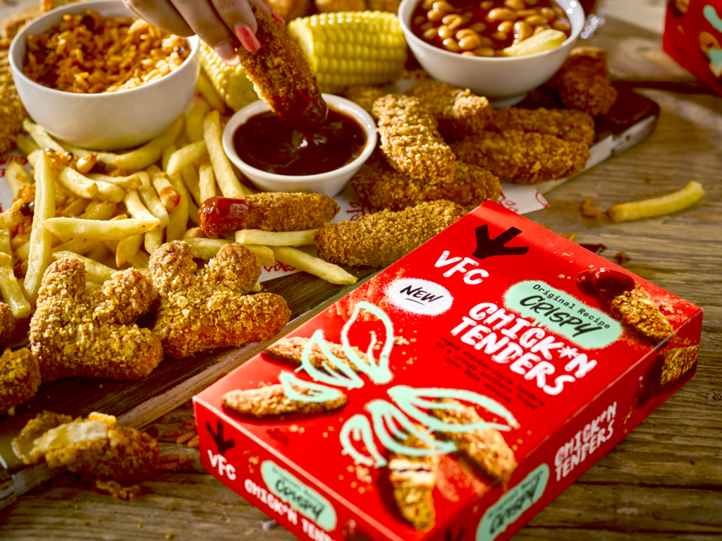
3. Red packaging implies flavorsome contents
Red was seen as the tastiest color when it came to the packaging of plant-based meat. 56% (UK) and 54% (US) of consumers associated red with superior taste.
→ Actionable insight: Use red in your packaging to highlight the deliciousness of your plant-based products, especially when targeting flexitarian and omnivores, who may not immediately gravitate towards products dominated by the color green. By breaking away from the green tones that are so prevalent in plant-based products, you can effectively distinguish your offerings from those of your competitors.
4. Blue packaging signifies affordability
Blue – the price-performance connection – signifies affordability in the minds of consumers while still promising quality. Remarkably, 48% of UK consumers associated the color blue with budget-friendly products. Furthermore, 37% of UK consumers and 45% of US consumers were willing to pay a premium for products packaged in blue.
Aside from this, blue was also the most universally favored color among consumers (their preferred color out of the options given, not related to plant-based food).
→ Actionable insight: Leverage blue to signal either budget-friendly or premium products – or both! Given its calming effect, blue can convey both cost-effectiveness and a willingness to pay more for quality.
5. Dietary preferences differ across nations
When examining dietary patterns, we saw that the US has a higher meat consumption compared to the UK, with 61% of US respondents identifying as omnivores, compared to 57% in the UK.
Correspondingly, the UK has a larger proportion of consumers following plant-forward diets – with vegetarians and vegans comprising 10% of those surveyed, while, among US respondents, only 6% were vegan or vegetarian.
→ Actionable insight: Recognize cultural distinctions in dietary patterns for successful promotion of plant-based food products – adjust packaging colors accordingly. In the UK, for example, capitalize on the growing demand for plant-based meat alternatives, emphasizing the health and environmental benefits.
6. Consumer sentiments and cultural nuances vary
While respondents in both countries expressed confidence in preparing plant-based meat (48% in the UK, and 47% in the US) as well as familiarity with plant-based ingredients (UK 52%, US 51%), the US lags in terms of accessibility, with only 47% reporting well-advertised plant-based options, compared to 57% in the UK.
These distinctions are tied to cultural factors. In the US, meat-eating is deeply ingrained, with 54% considering it an important part of their identity and 59% expressing a strong love for meat. In contrast, only 48% of respondents in the UK see meat-eating as part of their identity, and 56% love meat.
→ Actionable Insight: Bare these cultural nuances in mind when choosing packaging colors. In the US, tailored marketing strategies should highlight accessibility and convenience, while, in the UK, emphasizing the health benefits may resonate more effectively. Understanding these nuances is vital for effective product promotion and long-term success.
Conclusions
What color scored the best on average?
Overall, Green took the top spot for plant-based meat packaging, earning the highest positive ratings across the board. Green packaging seems to suggest healthiness, naturalness, and eco-friendliness for many consumers.
Orange and blue came in next in positive ratings, showing that they’re also strong contenders. These colors conveyed appeal, tastiness, and affordability, making them popular choices for packaging.
On the flip side, yellow, purple, and red didn’t fare as well in positive ratings. These colors didn’t excite consumers as much when it came to thinking positively about plant-based meat.
How willing are UK consumers to purchase plant-based meat?
During the study, respondents in the UK were asked how likely they were to ‘try’, ‘purchase’, ‘eat as a replacement’, and ‘pay a higher price’ for the plant-based meat product after seeing its packaging (in different colors). The results are encouraging:
• Try this product: While, for all colors, there was a strong eagerness to try plant-based meat products (40% to 45%), blue packaging stands out as being slightly more enticing when it comes to encouraging consumers to try plant-based meat products.
• Purchase this product regularly: Willingness to purchase plant-based meat products regularly ranged from 23% to 30%, with products in orange packaging leading the way.
• Eat this product as a replacement for conventional meat: The response varied from 30% to 41% across the six colors, with orange packaging inducing the highest willingness.
• Pay a higher price: Willingness to pay more than conventional meat for a plant-based meat product spanned from 18% to 37%, with blue packaging having the highest impact.
→ Takeaway: In the UK, blue emerged as the most enticing packaging color, driving a high willingness to try plant-based meat products and pay a premium, while orange packaging induced the strongest willingness to purchase regularly and increased the likelihood of a product being perceived as a replacement for conventional meat.
How willing are US consumers to purchase plant-based meat?
The report asked the same question (‘After seeing this plant-based meat product’s packaging, how likely are you to…’) to US respondents, with similarly insightful results:
• Try this product: Willingness to try plant-based meat products is generally strong (39% to 47%) – orange packaging received the highest rating, although by just a few percentage points.
• Purchase this product regularly: This ranged from 28% to 39%, with orange leading the way.
• Eat this product as a replacement for conventional meat: Percentages varied from 29% to 39%, with orange and green packaging having the highest appeal.
• Pay a higher price: Willingness to pay more than for conventional meat ranged from 26% to 45%, with blue packaging having the most appeal.
→ Takeaway: In the US, orange packaging stood out as a frontrunner and is the most likely color to induce a willingness to try plant-based meat products as well as make them a regular purchase. Blue packaging was particularly effective in inducing a willingness to pay a premium for these products.
Overall influence of packaging color on willingness to buy
In terms of the overall impact of color on purchasing decisions, 35% of respondents in the UK and the US said that packaging colors do not impact their food purchases.
However, more than one in four respondents (26%) indicated that packaging colors always or often impact their food choices, while 39% of consumers acknowledged that colors sometimes play a role when buying food products.
These findings suggest that while packaging color does not consistently drive purchasing decisions for all consumers, it remains a relevant factor, as colors convey subconscious information regarding quality, taste, pleasure, and even price to the consumer.
Actionable insights
Effective use of colors on plant-based meat packaging
Our report found that packaging colors have a real impact on consumers’ choices and their preference for plant-based meat products. Utilizing choice-architecture principles, especially employing captivating colors strategically, can revolutionize the promotion of plant-based meat consumption.
To optimize color in your plant-based meat packaging, follow these recommendations inspired by our research. These strategies will enhance alignment with consumer preferences, elevating your brand’s identity.
- Signal healthiness with green: Elevate health benefits, underline nutritional value, and reinforce sustainability. Incorporate imagery of fresh produce, natural elements, or health symbols.
- Communicate naturalness with green or blue: Signify naturalness while emphasizing natural ingredients, freshness, and minimal processing. Include images of plants, farm scenes, or natural landscapes.
- Indicate eco-friendliness with green or blue: Convey eco-friendliness and showcase sustainability efforts, as well as environmental impact and ethical sourcing. Feature eco-friendly logos, recycling symbols, or images of natural environments.
- Portray ethicalness with orange or green: Represent ethical choices while communicating ethical farming practices, animal welfare, and Fairtrade. Include images of happy animals, responsible farming, or ethical certification logos.
- Generate product appeal with yellow or purple: Create visual appeal with an eye-catching design. Incorporate bold graphics, appetizing food imagery, or engaging patterns.
- Emphasize taste with red, green, or purple: Convey delicious flavors and culinary satisfaction. Showcase mouthwatering dishes, flavourful ingredients, or chefs’ endorsements.
- Assure safety with green or orange: Ensure safety assurance, quality, and trustworthy sourcing. Include safety certifications, quality assurance logos, or images of safe food handling.
- Gesture affordability with blue or yellow: Suggest affordability and cost-effective alternatives. Feature price tags, discount labels, or value-related imagery.
For a deeper dive, uncover the full report, and hear from lead researcher Ajsa Spahic in our recent New Food Hub video interview.